Colorkit
A Compass extension for building color schemes in Sass.

A Compass extension for building color schemes in Sass.

Colorkit provides a library of default color variables, multiple utility functions and mixins, and a color scheme mixin that automatically generate the classes for building color pallets for use in responsive deliverables and style tiles.
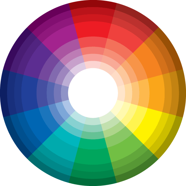
Colorkit's default color library is based off the primary colors red, yellow, and blue keywords defined in SVG and referenced in the Level 3 CSS Color Module. Secondary and tertiary colors are derived in equal parts using Sass's mix function. Each of these key-colors are then used in Colorkit's tint-stack, tone-stack, and shade-stack functions to produce the value stacks for each color. Each of these color swatches is given a variable name based of the BEM naming methodology, as defined here.
$color-name--value-name;
These are short-hand convenience functions for existing Sass script functions. Opaque gray scale functions are ideal for backgrounds and text.
black($tint);
white($shade);
.foo {
  background-color: white(40);
  color: black(75);
}
Alpha gray scale functions work the exact same way as the opaque functions, but use rgba. Alpha functions are ideal for drop shadows and highlights.
alpha-black($tint);
alpha-white($shade);
.foo-highlight {
  background: alpha-white(10);
}

.foo-shadow {
  background: alpha-black(25);
}
The color stack function takes a $main color, a $second color, and an $amounts variable to create a list (color pallet) of color values. The way the function works is it takes the two given colors and mixes them using each amount in the $amount variable. In Sass variables are treated as arrays, so it is possible to add additional amount variables with as many amounts as you wish. This color stack concept is borrowed from Team Sass' Toolkit. The tint-stack, tone-stack, and shade-stack opperate in the exact same way.
color-stack($main, $second, $amounts: $default-amounts);
The color scheme mixin generates harmonious color scheme variables based on a given $color-relationship, $base-color, and an optional argument $color-angle. The $base-color argument is the color-scheme's key-color that initiates all other colors. The $color-relationship takes the value of monochromatic, analogous, complementary, split-complementary, triadic, tetradic, or quadradic. The $color-angle argument defaults to 30 degrees, but can be overridden to any value. It is the degrees of separation (on the color wheel) between colors and allows additional calibration options to fine tune your color scheme.
@include color-scheme($color-relationship, $base-color, $color-angle);
When using the color-scheme mixin, you get a varying number of output variables based on the color relationship that is passed into the mixin which include a base-color (or key-color) and optionally a $complementary, a $secondaryA, and/or a $secondaryB color. Color theory concepts like this are often a lot easier to understand visually - here's a good resource for that.
The swatch generater mixin automatically generates class names along with the correct background color based on a given color list. The $color-swatch variable takes a list of colors. The $swatch-name variable is the class name. It defaults to "color-swatch" but can be overridden to whatever you want.
$color-swatches: color-stack(red, blue, $default-amounts);

@include swatch-gen($color-swatches, $swatch-name);
Example output for every item in the $color-swatches list:
.color-swatch-1 { background: #2600d8; }
The color-scheme-pallet mixin generates monochromatic, complementary, split-complementary, triadic, analogous, double-complementary, tetradic, and quadradic color-schemes along with (six by default) tints, tones, and shades of each color in your scheme. These colors are given class names automatically and can be used with the HTML Template when building pallets and style tiles.
It is important to note the first value in the $tint-stack, $tone-stack, and $shade-stack lists is the unadjusted color, meaning each stack includes the color which the stack was derived from. The adjusted colors in the stack begin at 2.
@include color-scheme-pallet($key-color);
The color-pallet partial is the main settings file for all Colorkit mixins and functions. This partial should be imported early in your main Sass file to make Colorkit available to your entire project.